Knights of the Cupboard
A 1v1 card gameDiscovery
To learn what information I needed to include on each card, I researched several other card games to see not only what information they included, but how and why the information was presented on each card.
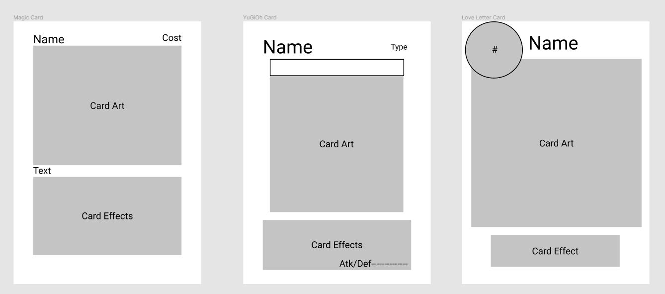
Each card layout I looked at had a few features in common:
- The most important information for players to see at a glance was located at the top of the card, which is the part of the card most visible when held in the player's hands.
- Card artwork was always given a large portion of the cards' real estate, as it is the main source of visual appeal for the card, and is an excellent secondary means of card identification.
- Information that did not appear on each and every card, or was not needed to be seen at first glance, was usually relegated towards the bottom of the card.
With this information, I was able to lay out wireframes for where I wanted to start my cards' designs.

Branding
I also worked with an artist to create the visual identity of Knights of the Cupboard. I wanted the visuals to have a softer feel, to reinforce the lighthearted design of the gameplay. I also needed the artwork to reflect the King Arthurian theme, so I asked the artist to save the brighter colors for the drinkware to help them stand out from the duller background colors.
While reviewing the artist's work, I also decided to use a gradient to merge the cards' artwork with the background behing the rules text. This change was made to help guide the player's eyes down the card to the more complex rules text below the art.

User testing
Throughtout each prior step, I tested each change I was making with potential players. These playtesters offered a wide variety of feedback on the game's look and feel, teaching me what they expected from the game based off of what they were presented with. Some issues that arose and were fixed due to playtesters' feedback included:
- Changing the circles at the bottom of the card to drinkware icons, to help players understand that the icons represented the number of each card present in the deck.
- Changing the number of cards present in the game, to make each round of gameplay shorter while making the average game last slightly longer.
- Adding "choose either yourself or your opponent" where necessary to reinforce the idea that card effects may be used on either player.

Conclusion
Knights of the Cupboard was a delightful project to see from its initial concept through its eventual manufacturing and release. To have a game exist with my name in the byline has always been a dream of mine, and now that dream has become a reality that I am very pleased with.
Creating it also taught me several important lessons about the necessity of frequent testing throughout each stage of the design process. Users' feedback is invaluble, and a necessity to create products that users will ultimately want to use. Knights of the Cupboard would not be half as good as it is without all of the individuals who helped me discover its flaws, and for that I can not thank them enough.